learning-css
sources
think of every HTML element like a box. The content is in the middle and is surrounded by padding, border and a margin. in that order from closest to furthest.
the amount of space used by every area can be specified with pixel values or responsive values that are relative to the parent element. or a % of the viewport itself.
tools like flex layout and grid layout control how elements flow together in a sophisticated way.
css can also detect user interaction with pseudo selectors like hover button:hover{}
can add logic to code with variables or custom properties and by making media queries that can apply styles conditionally based on the size and type of device.
can do complex animation with transitions and keyframes.
selectors
,and>1 level deep in:- example:
div > p, div has to be direct parent. In<div> <h2>My name is Donald</h2> <p>I live in Duckburg.</p> </div>.<p>will not get styled
- example:
#containerid selector.articleclass selectorbodyelement selector
[attribute],[attribute="value"], attribute selector
[attribute^="val",[attribute$="val",[attribute*="val"attributes that start/end/contain with letter
~sibling selector, siblings are elements that are in the same lvl and are declared after the current selected element.
+adjacent sibling combinator, selects if selector B immediately follows selector A and both are children of the same parent element.
Try to Keep slectors simple
pseudo classes for selection like :
div p:first-child{}ornth-child(n).
nth child can take as arguments:
nwhere n is a positive integerevenandoddAn + Bwhere A is int step size and B is int offsetof <selector>example:nth-child(-n + 3 of li.important)selects the frist 3 list items that that haveclass="important"set
instead ofli.important:nth-child(-n + 3) {that selects the list items that haveclass="important"in the first 3 list items
:last-child:has()andnot()for referencing if an element has or not a certain attribute set:enabledand:disabled, represents elements that can be activated (clicked, selected, typed into...) or accept focus.:is(p, div)selects the element if it is one of the selectors in the list:first-of-type,:only-of-type,:last-of-type:empty
But keep it simpler than this whenever possible
attributes
Are applied from top to bottom of the css file
When styles collide, the more specific selectors override the others
Specificy:
Id > class > element
2 main categories of attributes: color and layout and a bunch of random ones.
Color
- can be specified with color names (which are generic color codes) or
- color hex codes (#FF-FF-FF-FF) which end up representing RGB values from 0-255 and the last set of FF represent opacity
- can also represent color with the rgb(255, 255, 255, 1) function. same thing. first 3 args are RGB and 4th is opacity
- HSL(hue, saturation, light) hsl(360,100%, 100%, 0-1).
hue goes from 0-360 and represents which color is going to be used
saturation determines how colorful the color is. at 100% it is as colorful as it can be and at 0 there is no color (is going to be black, white or somewhere inbetween depending on light)
light how bright the color is. this is represented with float values from 0 to 1
Properties: color , background-color
size units
absolute
- px (pixel): standard, pixels on screen
syntax: npx where n is limited by the amount of pixels on the screen
relative
- % percent: amount of space percent based on the size of the parent element
100% - em
- rem
- fr (fractorial): each fr unic allocates one share of the available space. unit more common in grid size definitions.
Layouts:
Every element is made of a box.
Each content box is wrapped inside of
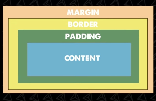
Width and heigth are the size of the content, and are best set as % of the parent container.
The padding attr cna be set with 1 (all 4 sides), 2(top and bottom, left and right) or 4 (top, right, bottom, left)
I can chage the position of things in the content with text-aling: <left,center,right>
Can also set attributes individually like padding-top, margin-left
An elements background color will apply to the padding as well but not the border and margin
Can set layout values with absolute pixel value or with REM (relative measurement, to font size). If you change the font size it will the space of everything. Ex: padding: 2rem. Can be useful for responsive designs
Border
Has a 3 part syntax
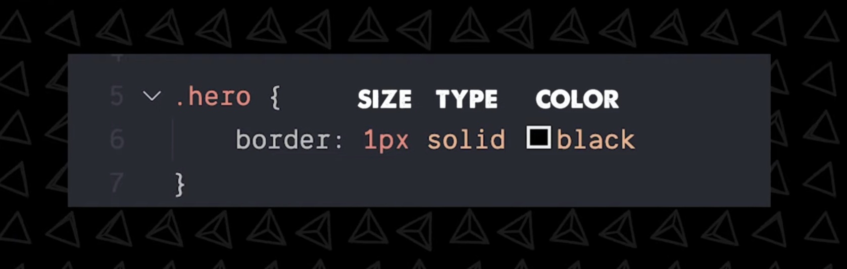
99% of the time you use solid type.
Margin
Works the same 1,2,4 syntax as padding
positions
position: static|relative|fixed|absolute|sticky property specifies the type of positioning method used for an element
position allows to take elements out of normal document flow and make them behave differently.
default is static.
Position is accompanied by top|right|bottom|left|z-index attributes
static: Static positioned elements are not affected by the top|bottom|left|right properties. is not positioned in any special way, it is always positioned according to the normal flow of the page.
relative: is positioned relative to its normal positoin. other content will not be adjusted to fit into any gap by the element.
fixed: elements are positioned relative to the viewport, meaning it always stays in the same place even if the page is scrolled. top|bottom|left|right are used to position the element.
works the same as absolute but instead of fixing relative to the parent element it usually places relative to visible portion of the viewport (an exception is if one of the elements ancestors is a fixed containing block bc it's transform prop has a value other than 'none'(so if ancestor has a set transform, fixed won't place the element relative to viewport)) .
This prop is useful for UI elements that are fixed in place like nav menus that are always visible no matter how much the page scrolls.
absolute: positioned relative to the nearest positioned ancestor. However, if an absolute positioned element has no positioned ancestors, it uses the document body, and moves along with page scrolling.
absolute positioned elements are removed from the normal flow, and can overlap elements.
[0,0] is placed on the top left corner of the parent element. an absolutely positioned element no longer exists in the normal document flow. so other elements act as if the element no longer exists and is next to them. useful for isolated layouts that don't interfere with other elements on the page like popup boxes, controle menus, rollover panes, drag n' drop UI features... (modals as well?)
sticky: is positioned based on the user's scroll position.
a sticky element toggles between relative and fixed, depending on the scroll position. It is positioned relative until a given offset position is met in the viewport. then it 'sticks' in place.
hybrid between relative and fixed. positioned element acts like it's relative until it's scrolled to a certain threshold (e.g, 10px from the top of the viewport), after which it becomes fixed. can be used to cause a navigation bar or an index to scroll with the page until a certian point and then stick to the top of the page.
Display
this prop specifies the display behavior (the type of rendering box) of an element.
display: none|inline|block|inline-block;
default is inline
inline: for things to stay on one continuous line.
displays an element as an inline element (like ) any height and width props will have no effect
block to space things out.
displays elements as a block element (like <p>). starts on a new line and takes the whole width,
inline-block to get benefits of both, like setting the margin of top and bottom but still at the same line.
contents: makes the container disappear, making the child elements the next level up in the DOM.
flex and grid displays an element as a block-level flex or grid container.
inline-flex, inline-grid inline-table display an element as an inline-level container.
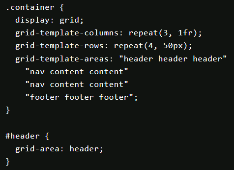
Grid display:grid;
allows to specify the exact grid, which is great for building based on a design or ux wireframe.
grid template
grid-template-rows:: the same as columns but for rows.
grid-template-columns: %|px|em|fr|auto|repeat(n, %)|min-content|max-content|minmax(min,max); defines how many columns the grid has, and the sizing (width) of each individual cell.
the auto value take the width of the entire parent element (similar to how 1fr does it), if there are 2 elements with auto they will divide the space equally. the difference between 1fr and auto is that auto automatically sets the size of the columns to the size of the container or the size of the contents of the elements in the column, depending on the situation.
min-content keyword value means it will expand the minimum necessary to view the content. for text it will take every softwrapping opportunity, so it would take width of the longest word of the text.
max-content represents the maximum width of the content. for text this means that the content will not wrap at all, even if it causes overflows.
- inside the
repeat(n, <measure>)function instead ofnI could use theauto-fillandauto-fitkeywords. auto fill means it will fill the available space with as many columns as it can fit. auto fit fits the currently available columns into the space by expanding them so that they take up any available space.
shorthands
grid-template-areas: <grid-area-name>|.|none *n^2: defines a grid (that must be rectangular, not T or L shapes) by referencing names of the grid area which are specified with the grid-area property. I can name the areas whatever I want.
other values can be . which signifies an empty cell and
none that means no areas are defined.
e.g
grid-template: rows / columns is shorthand for grid-template-row and column
grid-template: <grid-template-areas> <grid-template-rows> / <grid-template-columns>;
grid: none|<grid-template-rows> /
<grid-template-columns>|<grid-template-areas>|<grid-template-rows> /
<[grid-auto-flow] <rid-auto-columns>|<[grid-auto-flow] grid-auto-rows> /
<grid-template-columns>|initial|inherit;
auto placement of elements
grid-auto-flow: row | column; This prop controls the auto-placement algorithm. row fills each row in turn, adding new rows as necessary. column fills each column in turn, adding new columsn as necessary.
default is row
grid element positioning:
items
this works the same as flexbox
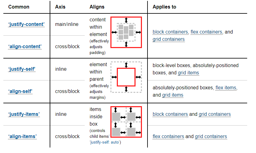
justify-items: start|end|center|stretch;
align-items: start|end|center|stretch;
place-items: <align-items> <justify-items>; shorthand
for single item positioning:
justify-self
align-self
place-self: <align-self> <justify-self>; shorthand
content
Sometimes the total size of your grid might be less than the size of its grid container. This could happen if all of your grid items are sized with non-flexible units like px. In this case you can set the alignment of the grid within the grid container.
justify-content:start|end|center|stretch|space-around|space-between|space-evenly;
align-content:;
implicit grid
when there are more grid items than cells in a grid, or when a grid item is placed outside of the grid, the grid container automatically generates grid tracks by adding grid lines to the grid. The explicit grid + these additional implicit lines forms the implicit grid.
the widhts and height of the implicit tracks are set automatically. They are only big enough to fit the placed grid items, to change their default behaviour:
grid-auto-rows:;:
grid-auto-columns:;:
gives control over the implicit tracks. they accept the same values a grid-template-columns; except the function repeat()
gap
column-gap: %|px|; sets the size of the gap between grid columns.
row-gap: %|px; the same as column-gap but for rows.
gap: <row-gap> / <column-gap>; shorthand for row-gap and row-column. or if only one value is given, it sets that value for both rows and columns.
grid area / selection
grid-column-start: n | span n : defines where the selection starts. It is counted by lines starting the count from 1. e.g a 2x2 grid has 3 lines that go from top to bottom
grid-column-end: n | span n
grid-column: n|span n / n|span n: shorthand syntax for grid-column-end and grid-column-start.
don't add the () and note the slash separating the values.
grid-row:: the same as grid-column but in the row direction.
grid-area: row-start / column-start / row-end / column-end: shorthand for both column and row.
order
order: n: if grid items aren't explicitly placed with grid-area, they are placed auto in the order of the source code.
default is 0
z : n: similar to order but for the z axis.
Flex display:flex
For general purposes and spacing as you go
-
flex-direction: row|row-reverse|column|column-reversesets the direction the flex places/stacks elements: east, west, south, north. north is the only flex that places/stacks elements bottom to top.
default isrow -
justify-content: flex-start|flex-end|center|space-between|space-around|space-evenlyaligns items horizontally, default isflex-start -
align-items:flex-start|flex-end|center|stretch|space-between|space-around|space-evenlyaligns items vertically, stretch is default and covers all space from top to bottom
space-between sticks items to start-center-end
space-around there is an even amount of space between each child
also look into space-evenly and gap props that have been added not so long ago.
-
align-self:aligns a child of a flex box element and aligns it despite the parent alignment. -
flex-grow: nthis prop enables elements to grow and fill the x axis (the justify axis).
n is a positive int. n describes how fast the elements grow in a ratios basis. (if 1 element has grow ratio 1 and another 2. the second element grows twice as fast to fill the space, for every 3 pixels: 1takes1 and 2 takes 2)
when usingflex-growyou don't have to worry aboutjustify-contentanymore. -
flex-shrink: ndescribes how elements react when there is not enough space to fit them all. also uses ratio to control how fast elements shrink.
default for elements is flex-shrink:1
flex-shrink: 0doesn't allow an element to shrink. -
flex-basis: <size val>|autothink of this prop as a betterwidthorheight. it is applied to child elements of a flex box.
takes presedence overwidth. if it is set, thenwidthis ignored. however,min-witdthacts as a lower limit and takes presedence over flex-basis. in the same waymax-widthacts as an upper limit of flex-basis.
in column direction, it controlsheightinstead, same goes formin-heightandmax-height.
flex-basis is a starting point, describes the sizing of things if there was enough space to contain every element. if they don't have space, they don't complain.
auto falls back to the with prop.
flex-shink: 0; means the element won't shrink past it's flex-basis value
flex basis is a hypothetical size before any growing or shrinking begins.
-
order: n: sets the element index order
n is an int, positive or negative, negative values send target element closest.
default isorder 0 -
flex-wrap: nowrap|wrap|wrap-reverse;: enables elements wrapping to the next line if they don't all fit in one.
default isnowrap
wrap-reversecreates the new line on top of the first line, instead of below. this setting reverses thealign-itemsprop.
shrinking happens after all possible new lines are created and spaces keeps shrinking. -
align-content: flex-start|flex-end|center|stretch|space-around|space-between: controls the alignment of wrapped new lines, rather than the individual zombies in that line.
default isalign-content: stretch -
flex: <grow> <shrink> <basis>: shorthand
leaving the 3rd parameter out sets basis to 0px by default (this is only when using the shorthand)
you can also leave off the 2nd parameter and it would set shrink to default 1
you could useflexonly setting the grow param. and it would set the other two to their defaults.
flex: auto;: sets grow to 1, shrink 1 and basis auto.
flex: none;: grow 0, shrink 0, and basis auto. -
flex-flow: <direction> <wrap>: another shorthand for setting direction and wrap
You can set custom positions as well by setting position:relative; and absolute on the child, the we set the top,right,bottom,left values to pixel or % values
difference between justify-content, justify-items and justify-self
pseudo-classes
Which are specified with a semicolon :. Ex button:hover{}
Inside pseudo classes you can specify transition (as in time it takes to transition from one state to another) and transform(changing position) properties which animate the effect.
Fonts
font-family: list of fonts to be used, usually has more than one font, in case the 1st fails.
font-size: typically don't want to set absolute px value bc they won't change if the user changes their browser font setting, instead use em or rem values
color: ;: sets font color
Background
background-color, background-image,
-repeat, -size, -position,
Can use backgroundshorthand syntax to put everything in one line
Box and drop shadow
Css generator cssmatic.co.
Vendor prefixes
-webkit- , -moz-
Are for new and experimental attributes that get added to css and backwards compatibility w older browsers
Animation
Google the animation u want lol
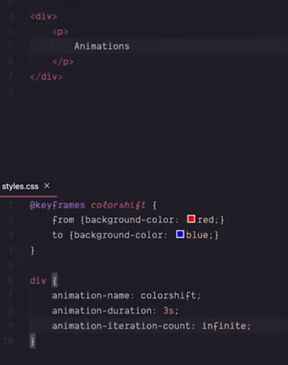
Also has shorthand syntax animation like background
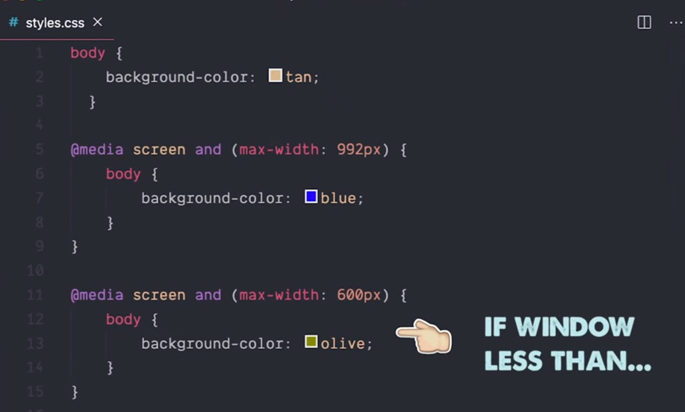
Media Queries
Allow to style for mobile and different screen sizes
Breakpoints are kinda like if statement that check the screen size.
Pre-processors
Like Sass
Add more syntax, variables, nested props
Doesn't do anything normal css can't.
In franeworks like react you will see css in js, which is called a styled component pattern.
https://youtu.be/ouncVBiye_M?si=qW4UboWtZUNVWKU8
You can write a global css file, but doesn't scale with bigger apps and naming gets difficult. You can use naming conventions but they are hard to get right.
In Next.js you can write css module files which are scoped to the module so naming doesn't conflict. You can also share properties within modules so you don't have to rewrite everything
Preprocessors
sass less stylus
Allows to write non css syntax that get compiled i to actual css
Scss (sass) adds features like variables, functions and mixins. This is great but is an entire different language, new features to learn, overhead, etc...
You can also write css in js like the styled components lib in React. Or natively with Svelte.
Benefits are doing programmatic stuff, creating dynamic styles (that change depending on app state) and scoped styles
One way to make web apps actually look good is by adding utilitiy libs like tailwind and windicss.
Big collection of utilitiy classes.
With tailwind you can write styles in an elements class attribute. Which tends to be faster since you write the style on the fly with lsp autocomplete.
Not everyone likes the utility class approach. Doesn't provide pre built components
Css frameworks
Like bootstrap or volma
Provides pre built styled components like buttons and cards.
To add to a project npm install it, import the bootstrap css styles file and start referencing the classes in the components, inside the className attr.
If only using the bootstrap style sheet you may want to wrap styles in a components in a way that can be efficiently used by other components.
Ex: u can have a bootstrap button component to avoid having to write the className references everytime.
Bootstrap ends up with a large bundle size mc of many unused styles.
Components libraries
In react it is recommended to use components libraries.
React Bootstrap, Mantine, ant, material design, chakra, tamagui